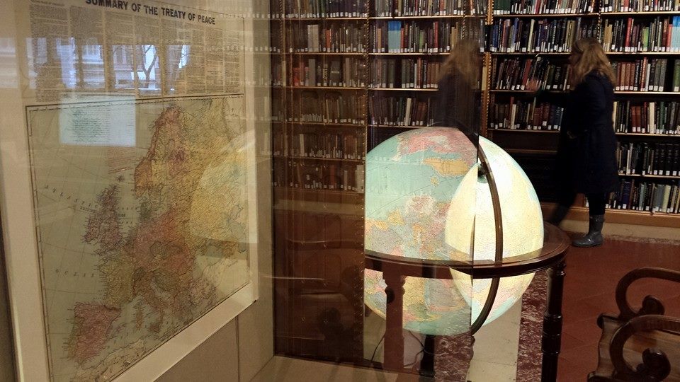
Today, I visited The Map Centre at the National Library of Norway. While I have been interested in maps as long as I can recall, I adore the artistry of old maps. In Paris, I fell in love with the pictorial map I saw in the gift shop at The Louvre, and I have a print of an example of the equivalent style depicting Beijing in the 1930s. Early in my time at ANU, when I went to the UN in New York, I made the time to go to the New York Public Library and visit their map room and contemplated the how the Peace Treaty of Versailles after WWI shaped the fate of Africans for generations to come.

My favourite security studies professor has a huge map on his wall with Australia at its centre, aiming to show what, or more importantly who, should be in Australia’s strategic focus. It’s very telling when you look at that map, it’s an orthographic projection, so Australia appears the way it would from space and many of the big name countries we often hear strategists talking about don’t even appear on the map.
Anyway, Norway’s Map Centre has the largest collection of Nordic maps and maps of the far north. The oldest maps date from 1482 and the newest from 1800. I’m visiting Scandinavia on an ANU Hansen Scandinavian Friendship Grant to help finish my PhD in International Relations. In addition to the specific institutions I’m visiting for my research, I’m trying to see the world, and current affairs, from a Scandinavian perspective while I’m here. Of course, to understand current affairs you have to understand past affairs.
Looking at these ancient maps was fascinating. It reminded me how we need to ask who the person is that decides if a place, people, or nation exists. Over the decades, and centuries, records like these appear to wipe out the existence of peoples and their nations. But also, like that map on my favourite professor’s wall, the world looks different depending on where you sit.
Some of the earliest maps that depicted Norway also depicted Lapland, but the Sami have spent generations being dispossessed of their lands across Scandinavia. Australia, of course, was nothing more than a curve indicating the north coast of the Kimberley on a map from the 1500s. Here, in Australia, the understanding of the significance of the German invasion of Poland in WWII largely comes from period British TV shows. So too, the horror at German occupation of Norway, but it’s only looking at how close those countries are to each other on these maps, and understanding their shared strategic history, does that all hit home.
But I thought two items were most telling of all for the present day. One was the book written by the brother of a Norwegian King who travelled to Rome seeking to be Archbishop of Scandinavia, describing the customs and fashions of his people to continental Europeans who found them so different from themselves. Even though they are new to NATO, most people around the world today would definitely think of Scandinavia as part of Europe. But so often, Scandinavian social policy and the emphasis on the rule of law to protect people, especially the most vulnerable, stands at odds with practice in other European countries.
The other item was the map that took the arctic as the centre point, and showed how close each of the Nordic countries are to Russia. Now more than ever, Finland, Sweden and Norway each feel the pressure of an antagonistic Russia with little counterbalance in a multipolar world, in which no one is able to rely on the United States… for anything.

Regardless, all these old maps can teach you a whole lot that you won’t learn from the Google Maps you keep in your pocket each day, and they look mighty fine while doing it!